A new design identity
The celebration of Baleri Italia's 40th anniversary, which culminated in the development of the new Manifesto, was an opportunity for the company to reflect on its image and rethink it in a contemporary, digital and international context. Based on the assumption that Baleri Italia design identity combines the historical traditions of tech rationalism and postmodernism, in the current context this composite identity evolves in the direction of sustainable freedom: the ideal union of formal cleanliness and aesthetic focus.


The rebranding and corporate image were entrusted to the Visual Design studio cccppp of Francesca Ceccoli and Andrea Puppa, who worked on a new logotype associated with a carefully designed color palette to best tell the story of the brand's identity. “We focused initially on the logotype,” the designers comment. “Careful research led us to identify in a newly designed typeface the right compromise between the continuity of values and recognizability of the sign, and greater lightness and accessibility-especially in function of digital declinations. As for the color system, the starting point was the color red, the historical identity of the brand. We identified a less aggressive shade of red, which is more accessible because it is closer to original earth tones. In accordance with red, the tones of three other fundamental colors were defined: white, black and gray. A special shade of blue, close to cerulean, identifies with a chromatic expedient the constant discourse on the values of sustainability within the brand philosophy. In the syntax of Baleri Italia's renewed language, every element, even the most immediate, is meant to contribute to reaffirming the uniqueness, authority and accessibility of this new identity.”

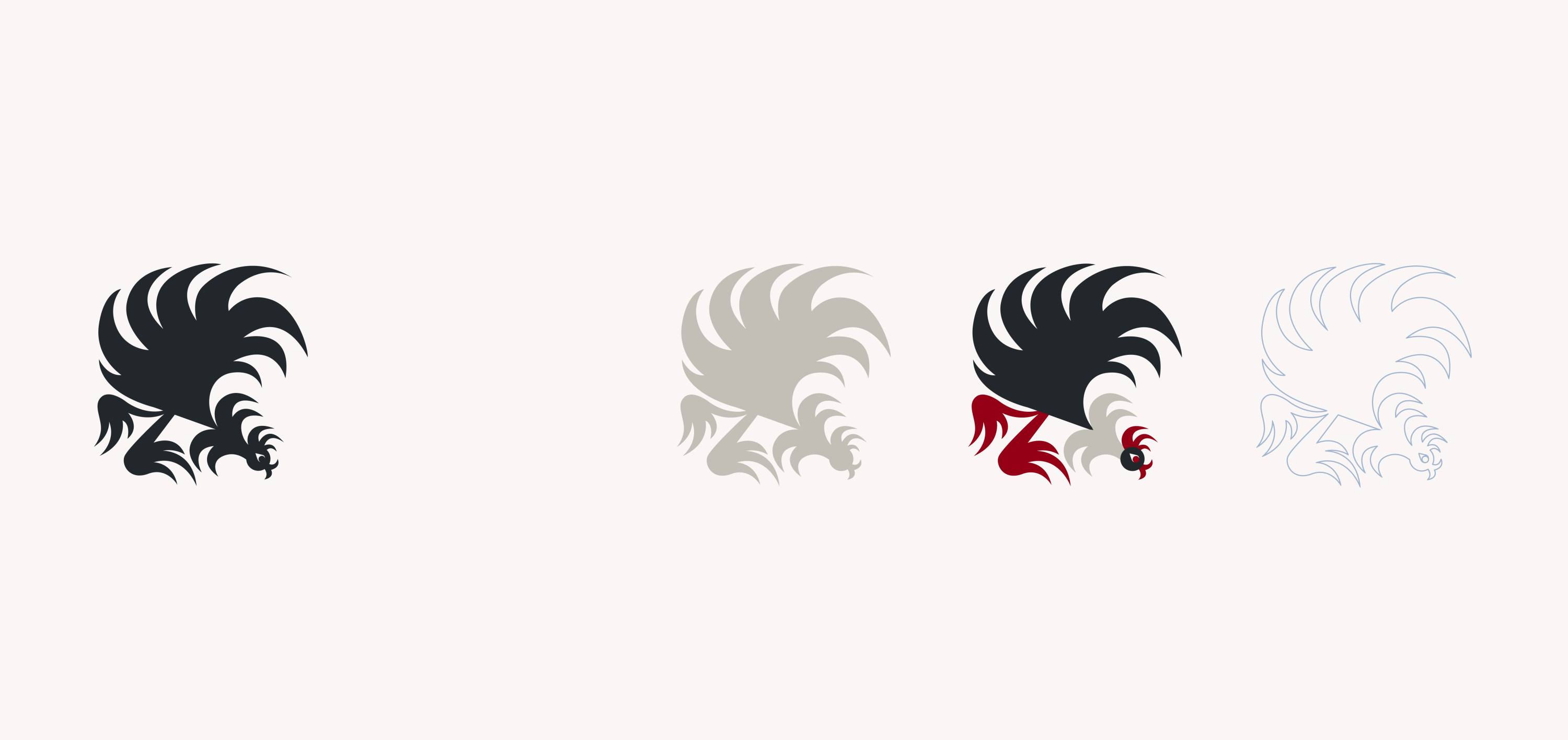
Last step, the revision of the design of the figurative element: the rooster that has been the symbol of Baleri Italia since the birth of the brand has radically changed thanks to the timely intervention of illustrator Sarah Mazzetti, known for her multidisciplinary orientation to image creation. Her work, characterized by constant personal research and drawing-centered art practice, is developed with an approach to visual storytelling specific to the type of project she is tackling. In the artist's words, “the drawing is done by hand, I always work this way because I want the images to retain the warmth of my mark and the movement necessary to make them. I started from the rooster and the Manifesto of Baleri Italia to develop a dynamic and engaging image. I detached myself a lot from the initial illustration to create a figure that had an inherent vitality, a proud and moving character. The new rooster has a strong playful aspect, intended to stimulate the curiosity of the viewer. Its formal appearance introduces a game of decompositions that I am already imagining for the future. It has been a very interesting project.”
